The Brooklyn Bridge
Like so many others before me, I found myself, with camera in hand, admiring a famous sight, the Brooklyn Bridge. But for the purpose of this post the bridge merely serves as an example, it could be any popular subject.
Surely this bridge is a sight to behold, a graceful construction arching the East River connecting the scenic skyline of Manhattan with Brooklyn. Like Michelangelo’s marble sculptures which artfully disguise their massive weight, the bridge seems afloat, weightless and suspended in mid air. Ken Burns Documentary will quickly teach you otherwise, detailing the immensity of the effort and construction. So there is good reason why this bridge makes for a popular background or subject in itself. In fact a simple, quick google image search generates a plethora of great captures. You will find images taken at all times of day, in all weather conditions, from all possible angles showing all imaginable details in black or in color.
The futility of yet another photo
Lets fast forward, a few years from now and all these google images will be available in high resolution, missing details from low quality shots can be inserted and corrected from other images. If you insist on a selfie an algo will paste you, your family and friends into any image with lights, proportions, colors corrected to look perfectly natural. We might not be there yet but sooner rather than later the database of such images and their generic manipulation will be at everyone’s disposal and you can leave the camera at home. All this suggested to me, there is not a single picture I can take which would materially add to what is already available. Still I went and took a series of images, returned and took some more. The following images are just three examples of photos I took. They all were shot from popular vantage points, their framing is common and as expected they add little or nothing to the existing pool of images. In particular, I didn’t find my shots particularly engaging. My response is more like, pretty, seen it before, lets move on.

no. 1

no. 2

no. 3
So whats next ?
Personally I view every negative or digital negative as just a starting point. The ultimate realization of it is for me the large print. Therefore the obvious place to deviate from the previously mentioned straight forward rendition of the bridge happens in the dark room, or photoshop. The funny thing is, it might not get me closer to transporting the emotional experience but it sure can take me into uncharted territory and that makes it worth while.The cables of the suspension system and their central perspective are one striking aspect when walking the bridge. A photographer calls this leading lines. So why not enhance this effect by rotating the image around a center to increase the number of leading lines. Voila this is a novel capture and for me it works. It brings across one aspect of my experience that original image could not.

no. 4
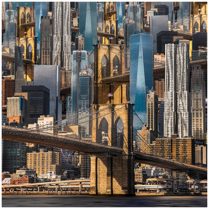
Secondly the bridge while in itself impressive would not have the same standing if it was not for the myth of New York City as expressed by the Manhattan skyline in the back ground. Gateway into the city of … (feel free to fill in whatever this city represents to you). An obvious way to exaggerate this or any aspect is through repetition. The skyline is dominated by the vertical lines of high rises, the bridge cuts diagonally across. Why not use these architectural themes and again repeat them by stacking it on top of each other, again and again. The bridge in warm colors, the buildings in cool colors are clearly separated to provide structure. With no horizon and smaller and smaller replications the image takes on a new quality, a little abstract yet still concrete enough to recognize the elements, the arrangement becomes confusing yet not unstructured. This might fail in rendering the emotions of the bridge alone, but if we take into account the chaos that NYC is, then we see why it could work.

no. 5
Did you ever straighten out a wrinkled picture, maybe even ironed it. I bet it was a small picture. In other words you have never done the same on a large scale. So that would be new and could look quite cool. But what do the wrinkles do? They disorganize everything just a little bit, straight lines and circles broken. For an image that lives from lines and symmetries that would be a material departure and what is static comes to life. In my version below the bridge begins to resemble the famous, dancing Tacoma Narrows bridge. To me the end result is more playful and a departure from the otherwise somber attributes attached to the Brooklyn Bridge. This playfulness is a fair reflection of the mood many visitors exhibit when they walk the bridge, its simply a jolly, fun experience. So that too is part of the Brooklyn Bridge experience.

no. 6
In conclusion, I did not yet manage to render the bridge in a way that properly transports my initial experience of it but I definitely departed from the webs formulaic examples and in the course of doing so discovered other aspects of the location that proved equally valid.
cheers
Matthias


Leave a comment